AI Coding Agents Can Build Dashboards, but Analysts Must Define the Questions

Alejandro AO argues that AI coding agents can build a working business dashboard quickly, but that speed does not replace the analyst’s judgment. In a bank marketing example, he starts by defining what campaign managers need to learn, checks what the dataset can support, and specifies KPIs before asking an agent to build the interface. He then reviews and revises the charts, while cautioning that observed patterns do not establish what caused them—or what will improve the next campaign.
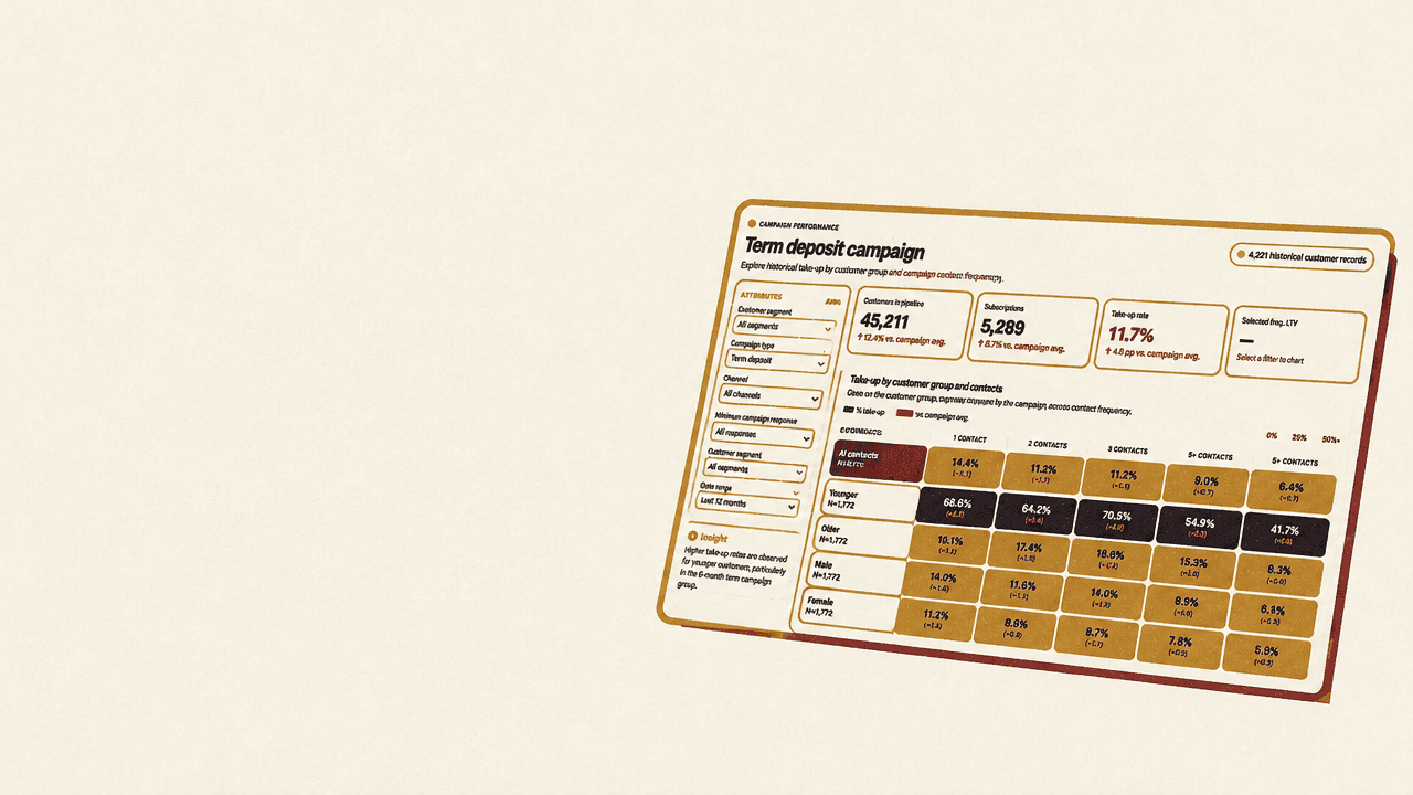
The dashboard starts with a decision, not a prompt
A useful dashboard is not the same thing as a dashboard an AI coding agent can produce. Alejandro AO’s central instruction is to keep the business question in view: understand what the data can support, decide which measures matter, and review whether the resulting interface helps a stakeholder answer those questions.
His example is a bank marketing team planning another campaign for term deposits. The dataset contains customer profiles, contact history and subscription outcomes. The manager’s practical question is not simply “What is in this CSV?” but “Who subscribed, how did results differ, and what should we investigate before the next campaign?” The questions on the workshop slide make that orientation explicit: which customer segments had higher subscription rates, how rates and sample sizes differed by channel, what appeared across levels of repeated outreach, and what further evidence would help plan the next campaign.
That framing matters because a historical dataset can describe patterns without establishing what caused them. The agent’s initial analysis found that customers contacted once had a 14.6% take-up rate, compared with 6.4% for those contacted five or more times. That is an association worth examining, not evidence that reducing calls would itself increase subscriptions. The data, as described in the source, does not include the sequence or outcome of each individual call, so it cannot show the incremental effect of each additional contact or identify an optimal contact cap.
The demonstration uses the Bank Marketing dataset on Hugging Face. Each row represents one customer record; the outcome, y, indicates whether the customer subscribed. The copy used in the demonstration has 45,211 rows and 5,289 subscriptions, an overall historical take-up rate of 11.7%.
The agent also flags limitations relevant to interpretation: the data lacks call costs, deposit amounts or margins, randomized assignment, customer IDs and call-level timelines. It therefore supports retrospective comparisons, not a calculation of campaign profit or proof that a particular intervention causes more subscriptions. The agent further warns that call duration is measured after a call has taken place, so it would leak information into a model meant to prioritize customers before the call. It notes, too, that the Hugging Face copy represents the original pdays = -1 value as 999 for no prior contact—a transformation an analyst would need to handle carefully.
That distinction sets the terms for the build. A dashboard can make comparisons easier to inspect; it does not turn those comparisons into causal findings. A clear interface may help a marketing manager decide what to investigate, but the available records do not establish which action will improve the next campaign.
Inspect the data before asking an agent to build
The workflow begins with access to the dataset, not with code. Alejandro demonstrates Hugging Face’s dataset viewer and Data Studio as places to inspect a dataset and ask questions without first loading it onto a local machine. In Data Studio, a chat agent can explain what the rows represent, describe the columns and suggest possible lines of exploration. The demonstration also shows the SQL console, where users can query the data directly.
For this dataset, the agent describes a direct-marketing campaign in which a Portuguese bank called clients to offer a term deposit. The records include who the customer is, earlier marketing history, how the customer was contacted and whether they subscribed. The agent identifies possible comparisons: take-up across age groups, marital status and education levels; financial characteristics such as balance and loan status; and campaign effectiveness. When asked for the unique values in the education column, it runs a query and returns four encoded values, 0 through 3. That is a useful reminder to clarify unfamiliar fields rather than treating coded values as self-explanatory.
Data Studio exploration and local dashboard development serve different purposes in this workflow. Data Studio is where Alejandro inspects the hosted dataset, asks about its structure and runs a query without downloading it to his machine. When the agent later builds the dashboard, the work moves into a coding environment: the coding agent uses the dataset link, accesses the data and creates an application that can be run locally for review. The distinction matters because an explanation or query in Data Studio is not yet the dashboard a stakeholder will use.
Alejandro then uses the dataset link with a coding agent, rather than downloading the data and attaching it to a chat. The agent’s response supplies a first pass at the data’s scope and limitations. It reports the overall baseline, proposes comparisons and identifies issues such as the call-duration field and the changed no-prior-contact value. The demonstration does not treat this response as a substitute for checking what the fields mean or deciding whether a proposed analysis answers the business question.
The point is not that an agent’s explanation should replace analyst judgment. Alejandro explicitly cautions against asking an agent to build a dashboard and accepting whatever it produces. The analyst needs to understand what is being built, identify surprising values and decide which questions are useful for the actual decision. In his formulation, the agent should not be left to “do whatever it wants”: the person working on the dashboard needs to retain a clear understanding of the project.
Define the measures before the interface
For the next campaign, the agent proposes several possible questions: which customer groups had higher take-up, whether there were enough customers in those groups to make them useful targets, how take-up differed by contact channel, and how it varied with the number of campaign contacts. Alejandro selects two for the demonstration: comparing customer groups and examining the association between contact count and take-up.
The next prompt asks the agent to propose a small set of KPIs, explain each calculation and say how filters or empty selections should affect them. The resulting measures include the overall baseline take-up rate; group size and share; group take-up rate and its difference from the baseline in percentage points; and take-up by contact-count band, comparing each band with the one-contact group. Suggested contact bands are one, two, three, four, and five or more contacts.
The denominators matter as much as the rates. A segment with a high take-up rate may contain too few customers to be a practical target. The proposed measures therefore pair group performance with the number and share of records in the group. Similarly, the contact-count comparison is framed as an observed difference, not as a prescription about how often the bank should call. The agent’s proposed definition—one dataset row as one customer record, and y = yes as take-up—makes the calculation legible before the interface is designed.
With questions and measures agreed, the agent is asked to sketch the dashboard before implementing it: which KPIs, charts and filters belong, and why? Alejandro finds the proposed plan reasonable, but stresses that this is where the analyst should exercise judgment. The agent can suggest a layout; the analyst has to decide what is useful for the manager and what deserves space. He accepts the suggested plan for the demonstration, while noting that a real project should use the analyst’s creativity and expertise to shape the views.
A first draft is a starting point for review
The first dashboard includes filters, summary metrics, charts for take-up by customer group and campaign contacts, and a customer-group table. Its top-line figures are 45,211 customers in scope, 5,289 subscriptions and an 11.7% take-up rate. The initial filters include campaign month, contact channel and previous campaign outcome. Those controls let a user narrow the population, but the first draft’s charts and table do not yet make the comparisons easy to read.
Alejandro’s assessment of that draft is direct: it works, but the visualizations are not yet telling the story clearly. The bar charts are hard to interpret, and the table makes it difficult to extract insights quickly. He gives the coding agent three specific changes: keep the filters but move them into a sidebar to give the plots more room; try a heatmap for the customer-group comparison, with useful hover tooltips; and replace the bottom table with an interactive plot.
The revised dashboard shown in the demonstration has a left-hand filter area, summary metrics across the top, a heatmap in the main area and an interactive plot below. The heatmap brings customer groups and contact counts into one view, while its tooltip exposes more information when the user hovers over a cell. Moving the filters away from the main chart area addresses a layout concern; changing the chart type is an attempt to make the comparisons more readily visible. Neither change, by itself, guarantees that the chosen comparison is the right one.
Alejandro uses the revised view to inspect patterns. He filters by channel and sees higher success within the first three contact counts in the cellular view; he says the pattern looks broadly similar across channels. He also examines job type, age, education, balance band and marital status. In the displayed view, he observes higher take-up among customers over 60, a tendency for higher-balance customers to have higher take-up, and less apparent difference by marital status. He sees take-up decline at higher contact counts. These are observations from the dashboard, not conclusions about why those groups differ or what would happen if the bank changed its targeting.
The review also exposes unresolved design questions. Alejandro suggests that the dashboard relies too heavily on contact count as one of its dimensions. It might be more useful to let a manager choose variables for the chart axes, or provide preset comparisons. Some categories could be reordered, and the page’s components could be reorganized. Even after the redesign, he says the heatmap may not be the right visualization.
That willingness to revise the revision is part of the method. An agent can implement a design suggestion, but it cannot decide on the analyst’s behalf whether the chart answers the business question. The finished interface remains a draft until it reflects the needs of its stakeholders. Alejandro’s own critique is specific to this example: the heatmap may not be the best choice, and the analyst should decide which dimensions and comparisons deserve to be shown.
Publishing the app does not settle who can see it
A locally running dashboard is not automatically available to a team. Alejandro’s final step is to publish the application as a Hugging Face Space, which can host applications beyond model demos. In the demonstration, he asks the coding agent to upload the dashboard as a private Space. He notes that a company or university team should create it under the organization, not an individual profile, and keep it private if access should be restricted. The organization’s permissions then determine who can access it.
The account and organization choices matter earlier in the workflow, too. Alejandro says the demonstration requires a Hugging Face PRO, Academia or Enterprise account because it uses PRO features. He shows authentication through the Hugging Face plugin in Codex and through the Hugging Face command-line interface with Claude Code. When authorizing access, he emphasizes selecting the organization associated with the intended permissions, so the tools can create repositories under that organization and make them available to the team. In the Claude Code example, a write-access test creates and then deletes a private repository.
The Space is online after upload, but the demonstration’s Space is private under Alejandro’s own profile, so only he can access it. For team sharing, it would need to be created under the organization with the intended privacy setting. A private Space under an individual profile is not the same as a private Space that the organization’s members can access. Publishing changes where the dashboard runs; it does not remove the need to configure access deliberately.
Alejandro describes the final dashboard as “half-baked.” The point is not that the build has failed: it is that the agent has assembled a working application, while the analyst still has to decide which measures, comparisons and visual forms are appropriate. The workflow is useful precisely because the analyst can keep shaping the result—questioning the data, defining the metrics, reviewing the charts and correcting the design—rather than treating the first generated dashboard as the answer.